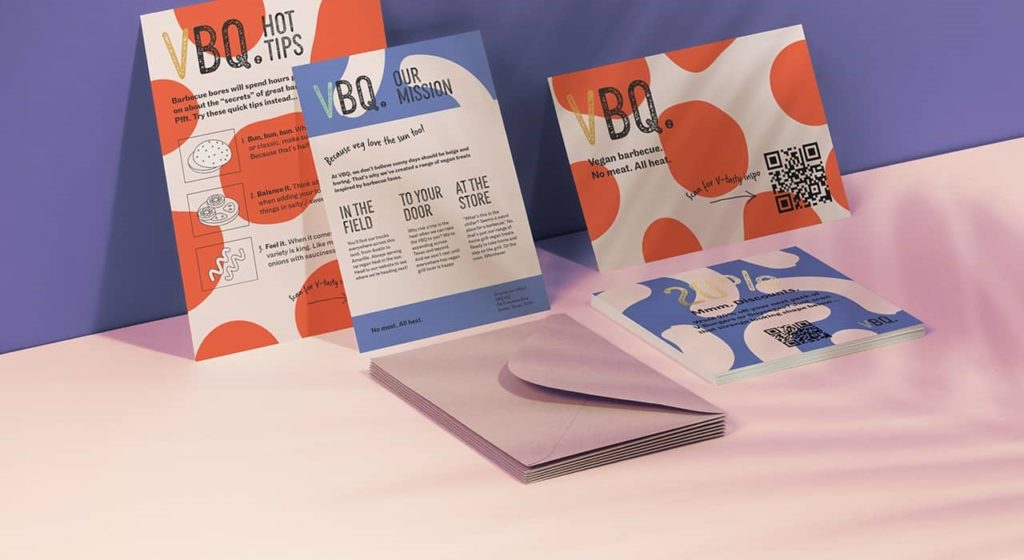
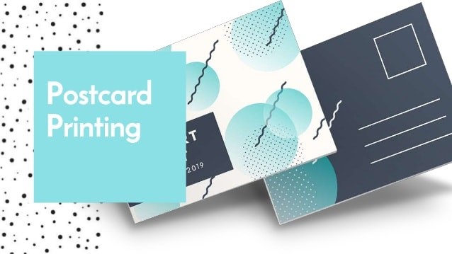
Postcard advertising campaigns are quite effective ways for a brand’s marketing. Direct mail postcards are simple informational cards that your recipient requires to take action and hopefully buy your service and product. These advertisements are designed to be simple to access and eye-captivating so your recipients will be more likely to hold your postcard.
A well-designed postcard is an effective tool to help improve your brand awareness and entire sales in a cost-effective way. This will be also more obvious if you thoroughly search your target demographic and personalize your postcards to create a powerful impact on your recipients. Once you include all these essential features, your postcard is on a successful road.
Here Are 8 Things
Here are 8 things you should consider before starting the postcard printing process.
Select a purpose for a postcard
The primary focus of direct mail postcards will be different depending on their purpose. If you are promoting your specific service or product, then it is necessary to add a relevant image to make your postcard stand out. Your postcard’s background can even be used to help focus the attention of readers on the focal point of your postcard. Use a neutral background to make the images and content stand out as well. Make things convenient for your potential clients and deliver your offer with clarity.
Enhance your postcard using white space
Overloading your postcard with images and text can appear overwhelming for your recipients. Instead of navigating through every piece of information, your recipients will avoid a complicated postcard, and throw it straight into the trash. By leaving few white spaces on your postcard, you can better focus the attention of readers on the main message of your postcard.
Include all the essential information
Ensure you include all the concise essential elements so that your recipients will be able to understand what you are conveying. Make sure to include an informative and catchy headline, a clear call to action, as well as an offer for your recipients that they simply can’t refuse. There must be a sense of unity among all of your design’s components. Don’t forget to put your most essential information on your postcard front so your readers will first come across it.
To coat or not to coat
Your postcard advertisement may stop serving the purpose of a notepad to write down numbers and messages. The stock type used for postcard printing can impact its ability to be written on. Uncoated stock is easy to write on using a pen, pencils, and markers
Alternatively, you can only leave one side of your postcard uncoated.

Choose thicker cardstock
Heavier and thicker cardstocks generally appear more important and valuable compared to lighter and thinner ones. When you create a postcard, consider its printing on thick cardstock such as 14 points or even higher to make it feel more necessary to your recipients. Moreover, thicker cardstock is strong and lasts long as it goes to handling and transit. Even though thicker cardstock is more expensive, but if your budget enables it, then it will be a worthwhile investment.
Understand UV coating
UV coating is one of the available options for both sides of direct mail postcards.
UV coating is an excellent way to make your postcard colors appear to resist fading and be more vibrant. If you are considering UV coating, ensure weighing the pros and cons when you make your decision. However, don’t use lots of UV coating as it can make it complicated for your postcard to be written on, and permanent markers are likely to smudge when they are wet.
Evade rounded corners on machineable postcards
Rounded corners can be jammed in automated machinery, and the perfect way to evade this is by using standard corners on your postcard. Rounded corners and the rest of the die cuts are best and greatly valuable for Neighborhood Mail and even for Special Handling Personalized Mail for a premium.
Preview your final product
Nothing is worse than thousands of postcard printing, just to find that your some content has been trimmed, and the final product is not how you pictured it. To evade this situation, print a singular preview of your final product asking for an e-proof. If it is exactly the thing you had in your mind, then go ahead with direct mail printing. If it is not, then go back to the designer for corrections. However, before you jump to that last step and begin your direct mailer, ensure all of your important content and formatting components have been included appropriately.
Conclusion
Designing your postcard to include all the essential elements, an informative and eye-captivating image, and a good balance of background colors and white space is the perfect way to connect your advertisements with its readers.
Making sure appropriate formatting and remembering your postcards’ purpose will help you save money and time spent correcting simple mistakes.


